PsiPog.net
View topic - The Official Sig & Photoshop Thread
PsiPog.net Forum IndexĀ»ĀGeneral DiscussionĀ»ĀThe Official Sig & Photoshop Thread
| The Official Sig & Photoshop Thread | |||
| Author | Message | ||
|---|---|---|---|
| Posted on Sat Jul 29, 2006 5:40 pm | |||
ahmed_khorshed_5
Joined: 28 May 2006 |
okay sparkz done a new one, what do you think of it now ???? | ||
| Back to top | |||
| Posted on Sat Jul 29, 2006 5:46 pm | |||
sparkz
Joined: 02 Feb 2006 |
better, yes.
nice drop shadow effect. but since this is the official sig and shop thread. we should try rating each others sigs. Ahmed. it's smaller, which is nice(still a bit too wide. one of the reasons i keep my sigs at 500 px width is so it doesn't go off the corner) , and it's got a pretty good quote on it, too. but it looks a little pixely and the edge of the flame looks a bit out of place. overall... 6/10 |
||
| Back to top | |||
| Posted on Mon Jul 31, 2006 10:01 am | |||
ahmed_khorshed_5
Joined: 28 May 2006 |
What can i do about it ???just to improve |
||
| Back to top | |||
| Posted on Mon Jul 31, 2006 10:10 am | |||
sparkz
Joined: 02 Feb 2006 |
mess around with the smudge tool on the bluey bit of that fire.
make it blend into the white. |
||
| Back to top | |||
| Posted on Mon Jul 31, 2006 10:14 am | |||
ahmed_khorshed_5
Joined: 28 May 2006 |
well actually the white part is a white stroke to the blue part | ||
| Back to top | |||
| Posted on Mon Jul 31, 2006 10:18 am | |||
sparkz
Joined: 02 Feb 2006 |
either make the white edge darker. or the middle bit brighter. like i said before. it looks out of place and seamy. | ||
| Back to top | |||
| Posted on Mon Jul 31, 2006 10:25 am | |||
ahmed_khorshed_5
Joined: 28 May 2006 |
i think i should remove this stroke at all and try somthing else !, well , I may do a whole new sig. , thanks for the advices , and bytheway i liked yur previuos sig/avatar cause , they had like your own logo even although i wasn't stunned with the grafics | ||
| Back to top | |||
| Posted on Sat Aug 19, 2006 8:48 am | |||
sparkz
Joined: 02 Feb 2006 |
apols for bumping an old topic. but it's better than starting a new one.
did some photoshop phuckups i though i'd share. 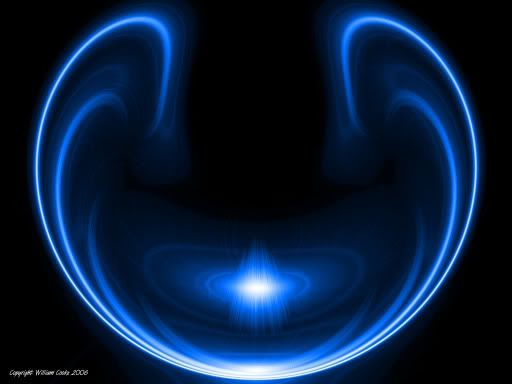
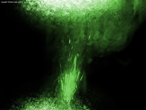
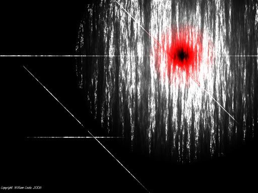
1024x768 wallpaper versions available here |
||
| Back to top | |||
| Posted on Sat Aug 19, 2006 2:02 pm | |||
Fakiti
Joined: 18 Jul 2006 |
Those are cool. Sparkz, your sig is an 8.5/10 IMO. Is mine any good?
I used fireworks |
||
| Back to top | |||
| Posted on Sat Aug 19, 2006 3:01 pm | |||
sparkz
Joined: 02 Feb 2006 |
it's good. yeah.
it's got a good textured background and the effect around the text is a nice touch. but i don't think the colour scheme does it much justice. overall 6.5/10 |
||
| Back to top | |||
PsiPog.net Forum IndexĀ»ĀGeneral DiscussionĀ»ĀThe Official Sig & Photoshop Thread
All Content, Images, Video, Text, and Software is © Copyright 2000-2006 PsiPog.net and their respective authors. All Rights Reserved.
You must agree to the Terms of Service and Privacy Policy to view this website. Click here to contact the webmaster.